Heatmap cluster for visualizing clustered gene expression data.
Source:R/heatmap_cluster.R
heatmap_cluster.RdHeatmap cluster for visualizing clustered gene expression data.
Usage
heatmap_cluster(
  data,
  dist_method = "euclidean",
  hc_method = "average",
  k_num = 5,
  show_rownames = FALSE,
  palette = "RdBu",
  cluster_pal = "Set1",
  border_color = "#ffffff",
  angle_col = 45,
  label_size = 10,
  base_size = 12,
  line_color = "#0000cd",
  line_alpha = 0.2,
  summary_color = "#0000cd",
  summary_alpha = 0.8
)
Arguments
- data
Dataframe: Shared DEGs of all paired comparisons in all samples expression dataframe of RNA-Seq. (1st-col: Genes, 2nd-col~: Samples).
- dist_method
Character: distance measure method. Default: "euclidean", options: "euclidean", "maximum", "manhattan", "canberra", "binary" or "minkowski".
- hc_method
Character: hierarchical clustering method. Default: "average", options: "ward.D", "ward.D2", "single", "complete","average" (= UPGMA), "mcquitty" (= WPGMA), "median" (= WPGMC) or "centroid" (= UPGMC).
- k_num
Numeric: the number of groups for cutting the tree. Default: 5.
- show_rownames
Logical: boolean specifying if column names are be shown. Default: FALSE, options: TRUE or FALSE.
- palette
Character: color palette used in heatmap. Default: "RdBu", options: 'Spectral', 'BrBG', 'PiYG', 'PRGn', 'PuOr', 'RdBu', 'RdGy', 'RdYlBu', 'RdYlGn'.
- cluster_pal
Character: color palette used for the cluster. Default: "Set1", options: 'Set1', 'Set2', 'Set3', 'Accent', 'Dark2', 'Paired', 'Pastel1', 'Pastel2'.
- border_color
Character: cell border color (color name or hex value). Default: "#ffffff".
- angle_col
Numeric: angle of the column labels. Default: 45.
- label_size
Numeric: fontsize for the plot. Default: 10, min: 0.
- base_size
Numeric: base font size. Default: 12, min: 0.
- line_color
Character: trend lines color. Default: "#0000cd".
- line_alpha
Numeric: trend lines alpha. Default: 0.20, min: 0.00, max: 1.00.
- summary_color
Charater: summary line color. Default: "#0000cd".
- summary_alpha
Numeric: summary line alpha. Default: 0.80, min: 0.00, max: 1.00.
Examples
# 1. Library TOmicsVis package
library(TOmicsVis)
# 2. Use example dataset
data(gene_expression2)
head(gene_expression2)
#> Genes CT_1 CT_2 CT_3 LT20_1 LT20_2 LT20_3 LT15_1 LT15_2 LT15_3 LT12_1
#> 1 ACAA2 24.50 39.83 55.38 114.11 159.32 96.88 169.56 464.84 182.66 116.08
#> 2 ACAN 14.97 18.71 10.30 71.23 142.67 213.54 253.15 320.80 104.15 174.02
#> 3 ADH1 1.54 1.56 2.04 14.95 13.60 15.87 12.80 17.74 6.06 10.97
#> 4 AHSG 0.00 1911.99 0.00 0.00 0.00 0.00 0.00 0.00 0.00 0.00
#> 5 ALDH2 2.07 2.86 2.54 0.85 0.49 0.47 0.42 0.13 0.26 0.00
#> 6 AP1S3 6.62 14.59 9.30 24.90 33.94 23.19 24.00 36.08 27.40 24.06
#> LT12_2 LT12_3 LT12_6_1 LT12_6_2 LT12_6_3
#> 1 497.29 464.48 471.43 693.62 229.77
#> 2 305.81 469.48 1291.90 991.90 966.77
#> 3 10.71 30.95 9.84 10.91 7.28
#> 4 0.00 0.00 0.00 0.00 0.00
#> 5 0.28 0.11 0.37 0.15 0.11
#> 6 38.74 34.54 62.72 41.36 28.75
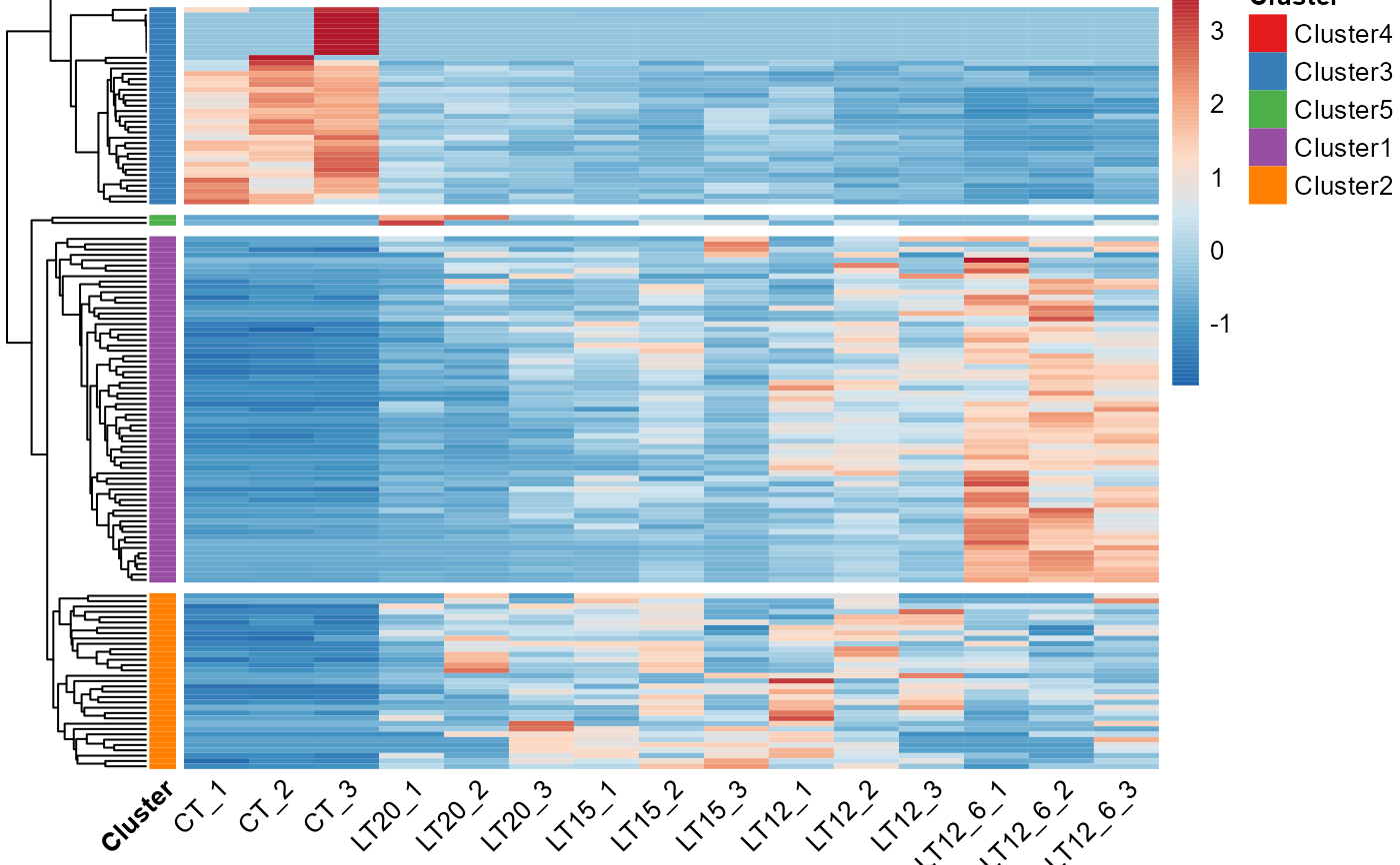
# 3. Default parameters
heatmap_cluster(gene_expression2)


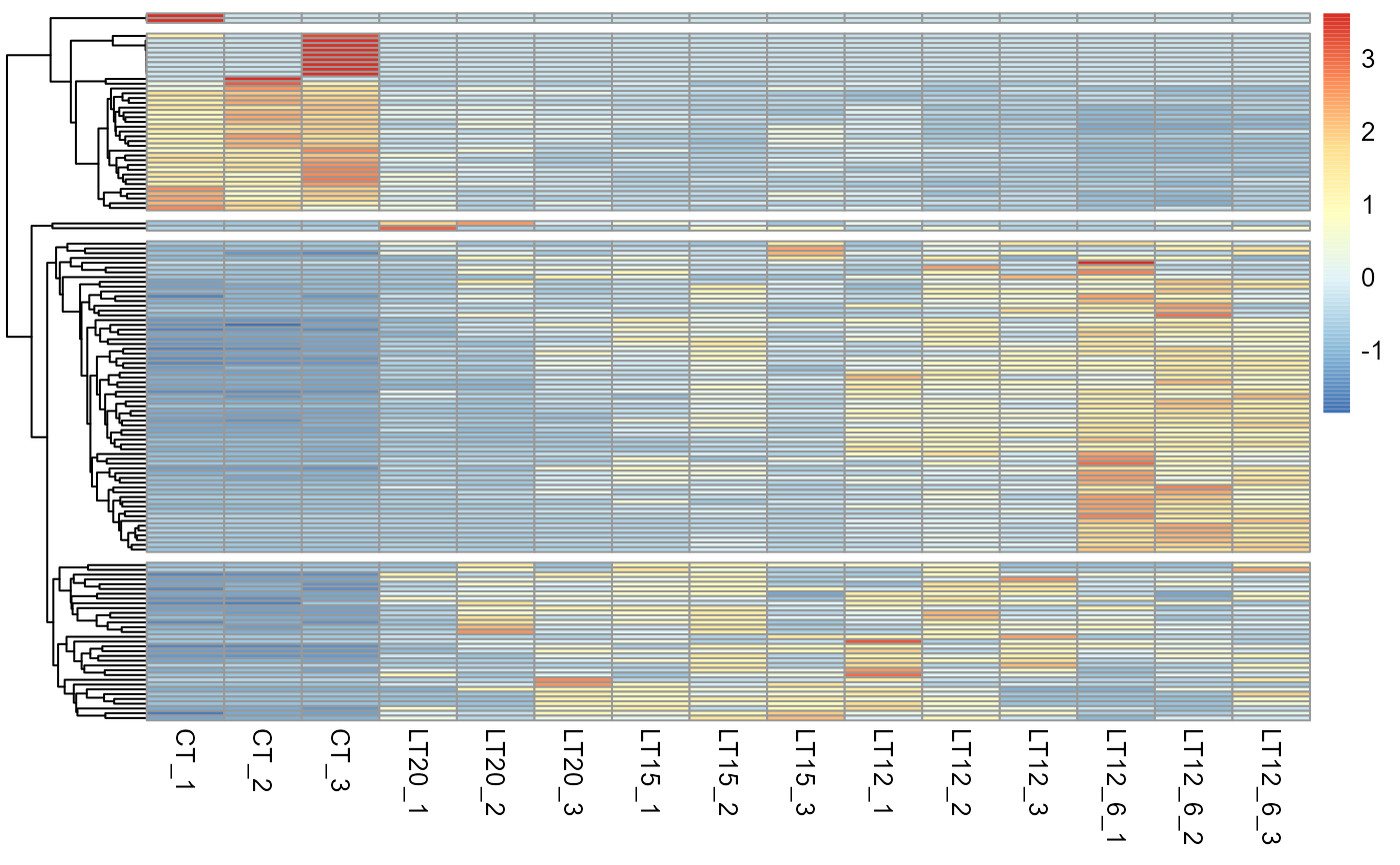
 # 4. Set palette = "PuOr"
heatmap_cluster(gene_expression2, palette = "PuOr")
# 4. Set palette = "PuOr"
heatmap_cluster(gene_expression2, palette = "PuOr")
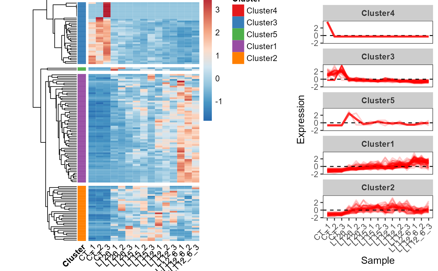
 # 5. Set line_color = "#ff0000", summary_color = "#ff0000"
heatmap_cluster(gene_expression2, line_color = "#ff0000", summary_color = "#ff0000")
# 5. Set line_color = "#ff0000", summary_color = "#ff0000"
heatmap_cluster(gene_expression2, line_color = "#ff0000", summary_color = "#ff0000")