Quantile plot for visualizing data distribution.
Usage
quantile_plot(
  data,
  my_shape = "fill_circle",
  point_size = 1.5,
  conf_int = TRUE,
  conf_level = 0.95,
  split_panel = "Split_Panel",
  legend_pos = "right",
  legend_dir = "vertical",
  sci_fill_color = "Sci_NPG",
  sci_color_alpha = 0.75,
  ggTheme = "theme_publication"
)
Arguments
- data
Dataframe: Weight and Sex traits dataframe (1st-col: Weight, 2nd-col: Sex).
- my_shape
Character: scatter shape. Default: "fill_circle", options: "border_square", "border_circle", "border_triangle", "plus", "times", "border_diamond", "border_triangle_down", "square_times", "plus_times", "diamond_plus", "circle_plus", "di_triangle", "square_plus", "circle_times","square_triangle", "fill_square", "fill_circle", "fill_triangle", "fill_diamond", "large_circle", "small_circle", "fill_border_circle", "fill_border_square", "fill_border_diamond", "fill_border_triangle".
- point_size
Numeric: point size. Default: 1.5, min: 0.0, max: not required.
- conf_int
Logical: confidence interval (CI). Default: TRUE, options: TRUE or FALSE.
- conf_level
Numeric: confidence interval value. Default: 0.95, min: 0.00, max: 1.00.
- split_panel
Character: split panel by groups. Default: "Split_Panel", options: "One_Panel", "Split_Panel".
- legend_pos
Character: legend position. Default: "right", options: "none", "left", "right", "bottom", "top".
- legend_dir
Character: legend direction. Default: "vertical", options: "horizontal", "vertical".
- sci_fill_color
Character: ggsci fill or color palette. Default: "Sci_NPG", options: "Sci_AAAS", "Sci_NPG", "Sci_Simpsons", "Sci_JAMA", "Sci_GSEA", "Sci_Lancet", "Sci_Futurama", "Sci_JCO", "Sci_NEJM", "Sci_IGV", "Sci_UCSC", "Sci_D3", "Sci_Material".
- sci_color_alpha
Numeric: ggsci border color alpha. Default: 0.75, min: 0.00, max: 1.00.
- ggTheme
Character: ggplot2 themes. Default: "theme_publication", options: "theme_default", "theme_bw", "theme_gray", "theme_light", "theme_linedraw", "theme_dark", "theme_minimal", "theme_classic", "theme_void".
Examples
# 1. Library TOmicsVis package
library(TOmicsVis)
# 2. Use example dataset
data(weight_sex)
head(weight_sex)
#> Weight Sex
#> 1 36.74 Female
#> 2 38.54 Female
#> 3 44.91 Female
#> 4 43.53 Female
#> 5 39.03 Female
#> 6 26.01 Female
# 3. Default parameters
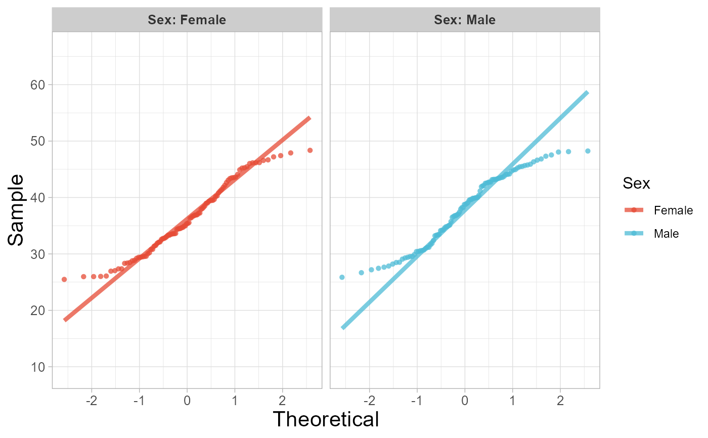
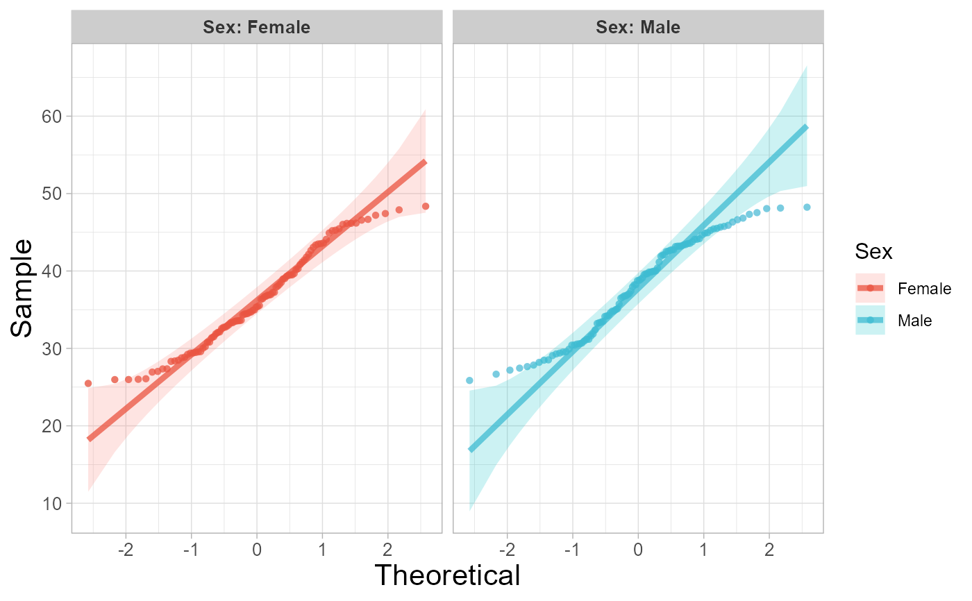
quantile_plot(weight_sex)
 # 4. Set split_panel = "Split_Panel"
quantile_plot(weight_sex, split_panel = "Split_Panel")
# 4. Set split_panel = "Split_Panel"
quantile_plot(weight_sex, split_panel = "Split_Panel")
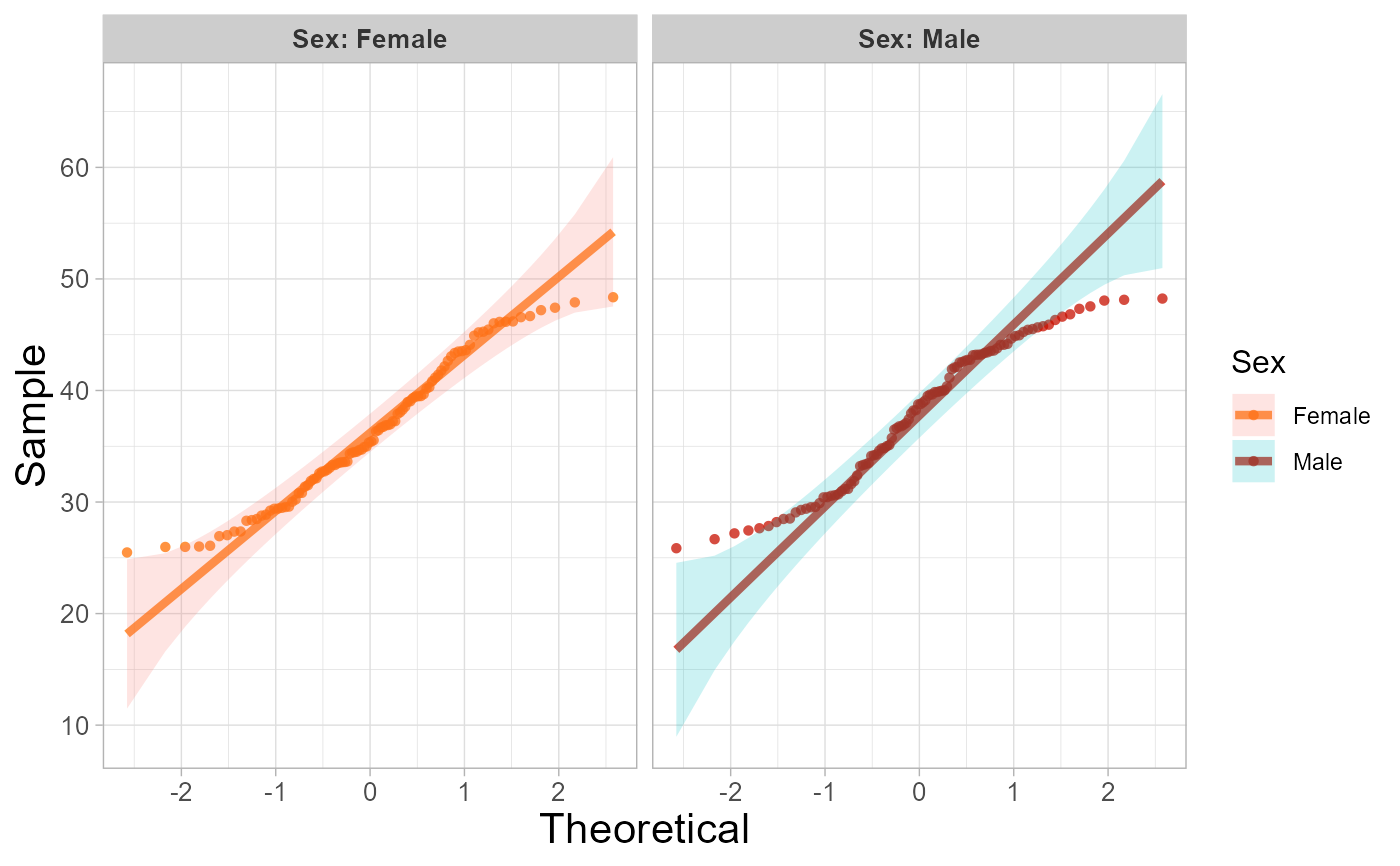
 # 5. Set sci_fill_color = "Sci_Futurama"
quantile_plot(weight_sex, sci_fill_color = "Sci_Futurama")
# 5. Set sci_fill_color = "Sci_Futurama"
quantile_plot(weight_sex, sci_fill_color = "Sci_Futurama")
 # 6. Set conf_int = FALSE
quantile_plot(weight_sex, conf_int = FALSE)
# 6. Set conf_int = FALSE
quantile_plot(weight_sex, conf_int = FALSE)